Pie graph: This is one of the most highly used graphs because each of the sectors used are compared to the total. The chart is based on a 100% scale and each of the slices are percentages of the whole thing. The pie chart is best used when representing how the measured statistic is compared to the whole “pie” and generally not used when statistics are compared to each other.

Column Graph: This graph is used when comparing two or more pieces of data, and not necessarily data is more accessible to people. Gives people a sense of range of data.

Bar graph: Bar graphs are horizontal column graphs. Bar graphs are used to plot discrete data. On the left hand side of the graph are the names of the things that the user wants to plot and on the bottom is the values that the user is using to compare the data.

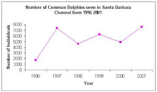
Line Graph: This type of graph displays information as a series of data points connected by straight-line segments. A line graph is best used when wanting to show relative value, compare a few statistics, percentages or show changes over time.

1 comment:
proof read your work carefully - your column graph description doesn't make sense
Post a Comment